Skills
Data processing, prototying, Adobe Illustrator
Team member
Charlie Abbott, JaYoung Lee
Role
Interaction Designer
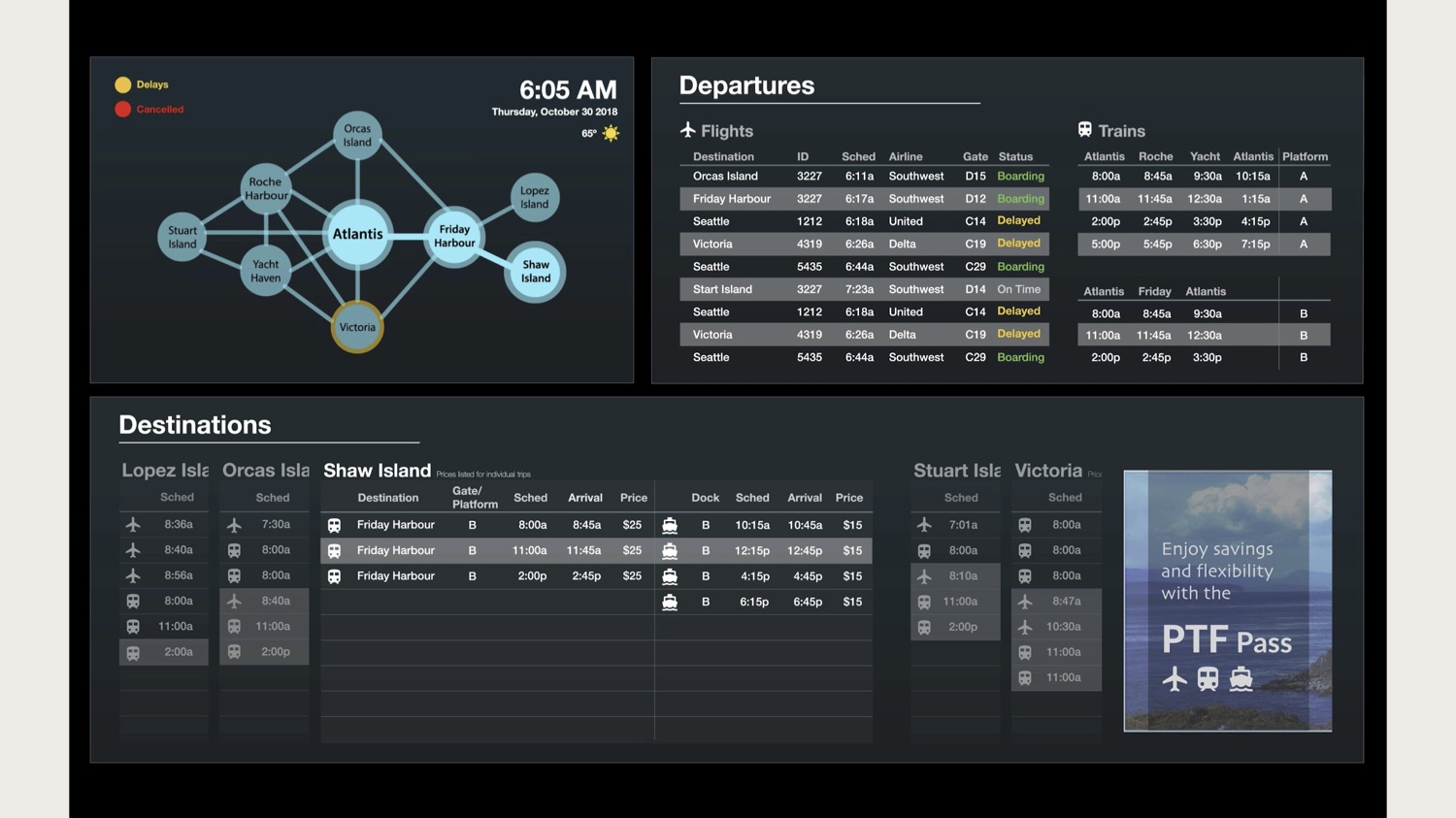
Atlantis Transit Hub - Data visualization
This project visualizes fictional transportation data at the Atlantis Transit Hub of the San Juan Islands. This goal of this project is to create a data-driven display based on understanding of stakeholders and the characteristics and attributes of the data.
Animation Demo
Presentation


Process
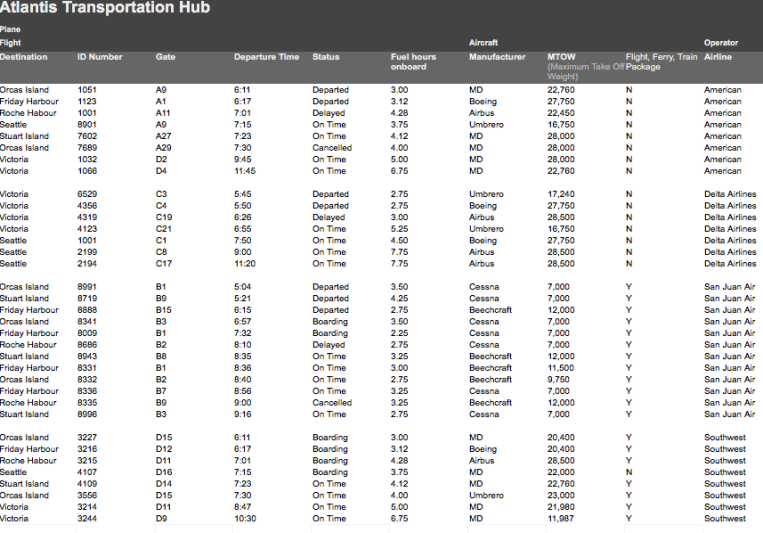
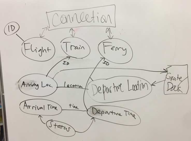
Data analysis
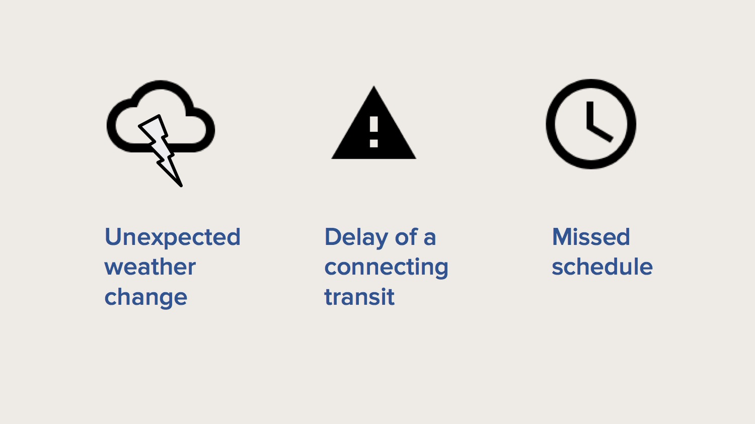
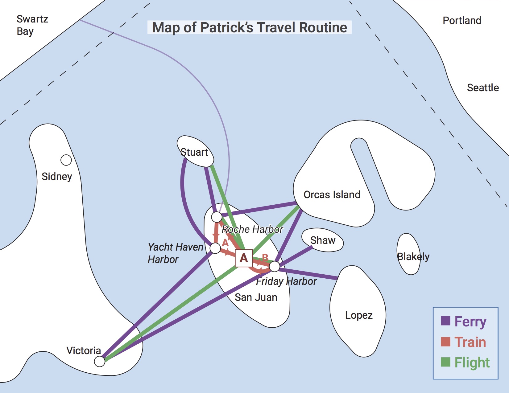
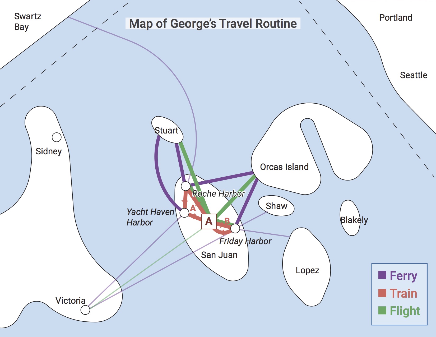
Starting from the raw data guided us in creating a design strategy. We reviewed the available information for the given transportation methods, allowing us to group together different modes and destinations. First, we listed all the subcategories of each transportation. We then narrowed down to the important subcategories (such as time, location, and ID) and tried to map out the relationship between them.
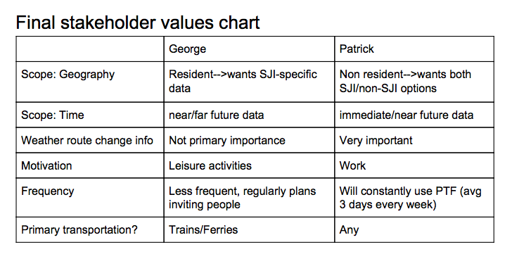
Persona Analysis
We approached the display design from the perspective of our stakeholders, focusing on the consumers of the display (George and Patrick) in order to better understand their experience at the San Juan Islands. We felt that focusing on these stakeholders, making a display that was easier to use, encouraging users to travel more, thusly also serving Elizabeth’s values, as the travel director for the islands. We made a visualization of each persona’s possible use cases, coming from divergent perspectives of a family-oriented resident and a business traveler who values efficiency, to see how the similarities and differences could aid our process.
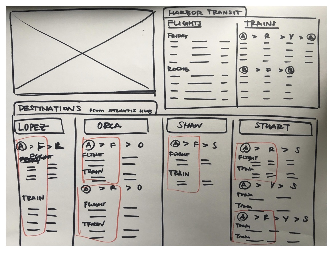
Low-fi prototypes
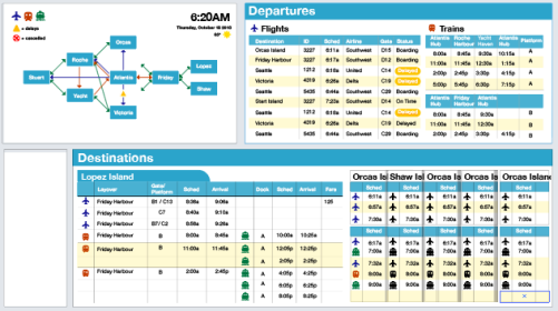
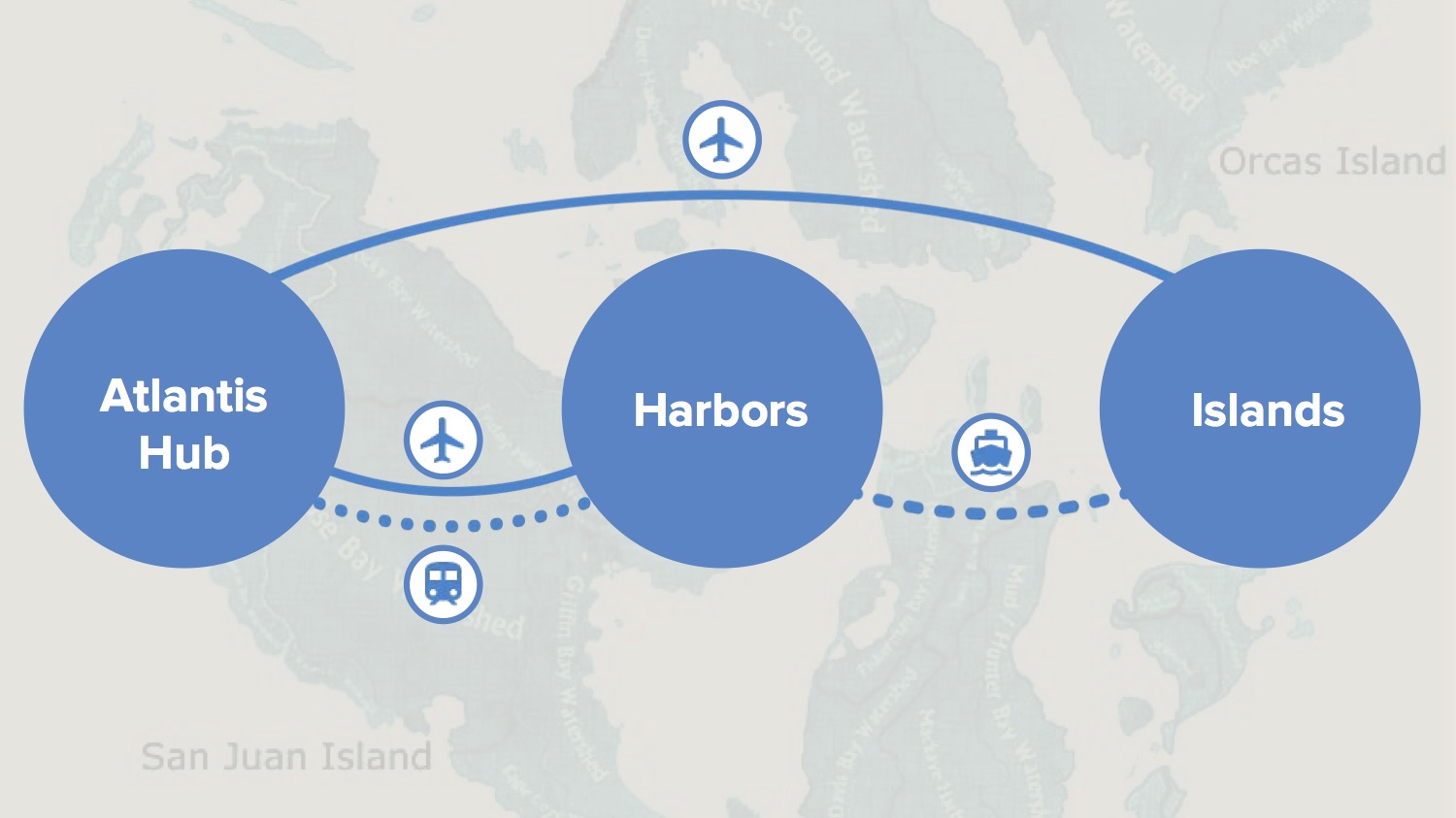
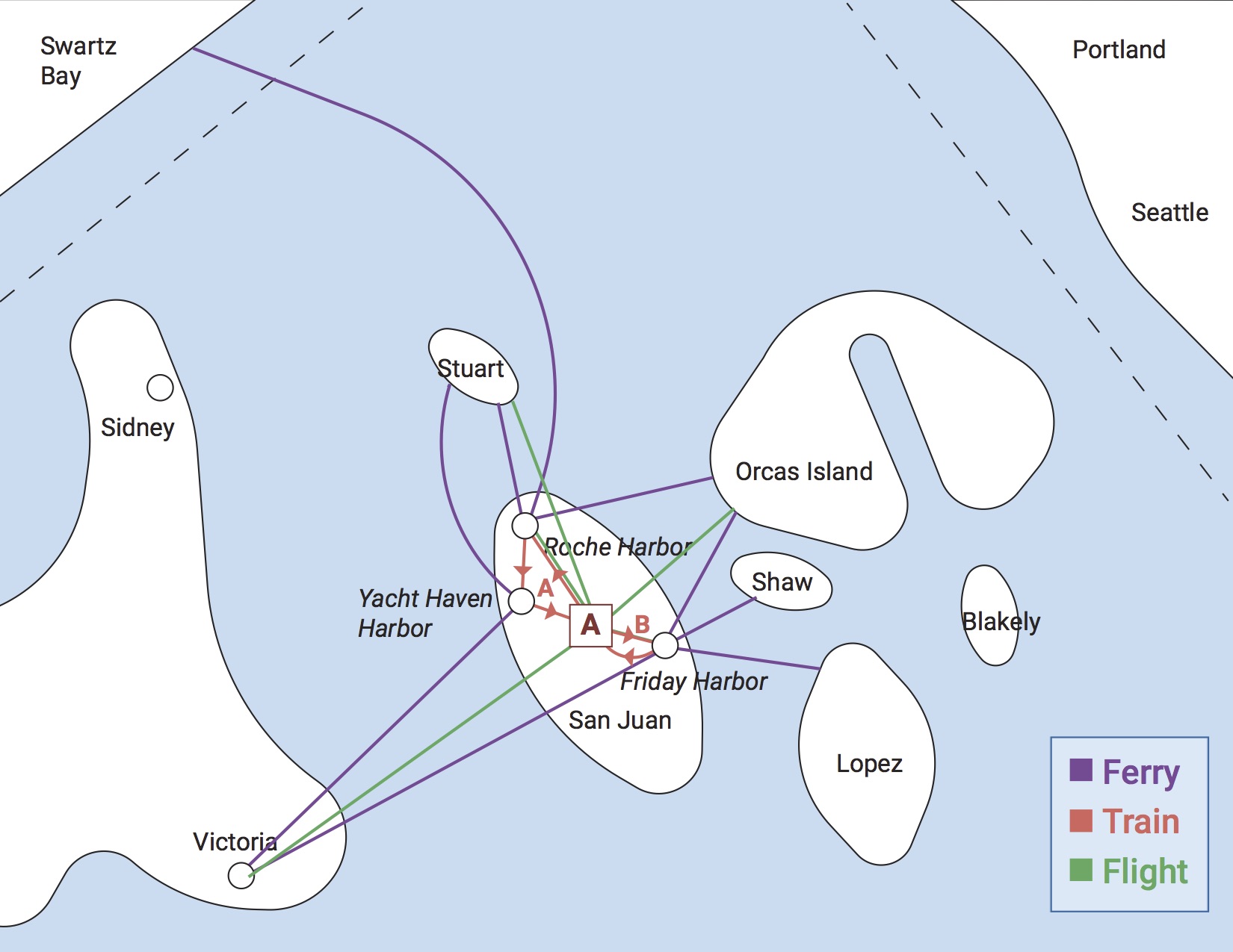
Our initial sketches tried to imagine how to display information in both different ways and for different consumers. We decided that since the Atlantis hub was located within the San Juan Islands, we would focus on the individual islands as the ultimate destination for a large portion of our display (the lower half of the display). Since this would usually require more than one mode of transfer, we wanted to group together these different modes to streamline itinerary planning. We also realized that this may be an inefficient way to view immediate departures from the hub, so we included a more traditional kind of travel display that showed a chronological list of departures from the hub, ordered from most to least immediate. Finally, an inclusion of a map showing the different transportation modes to each harbour/island would aid in comprehension by allowing users to visualize an itinerary rather than having to construct it from the detailed schedules.
Digital prototypes
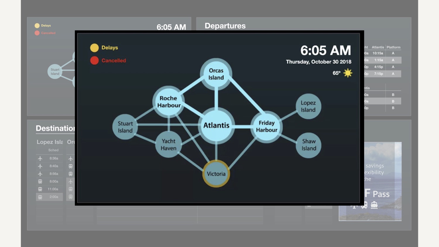
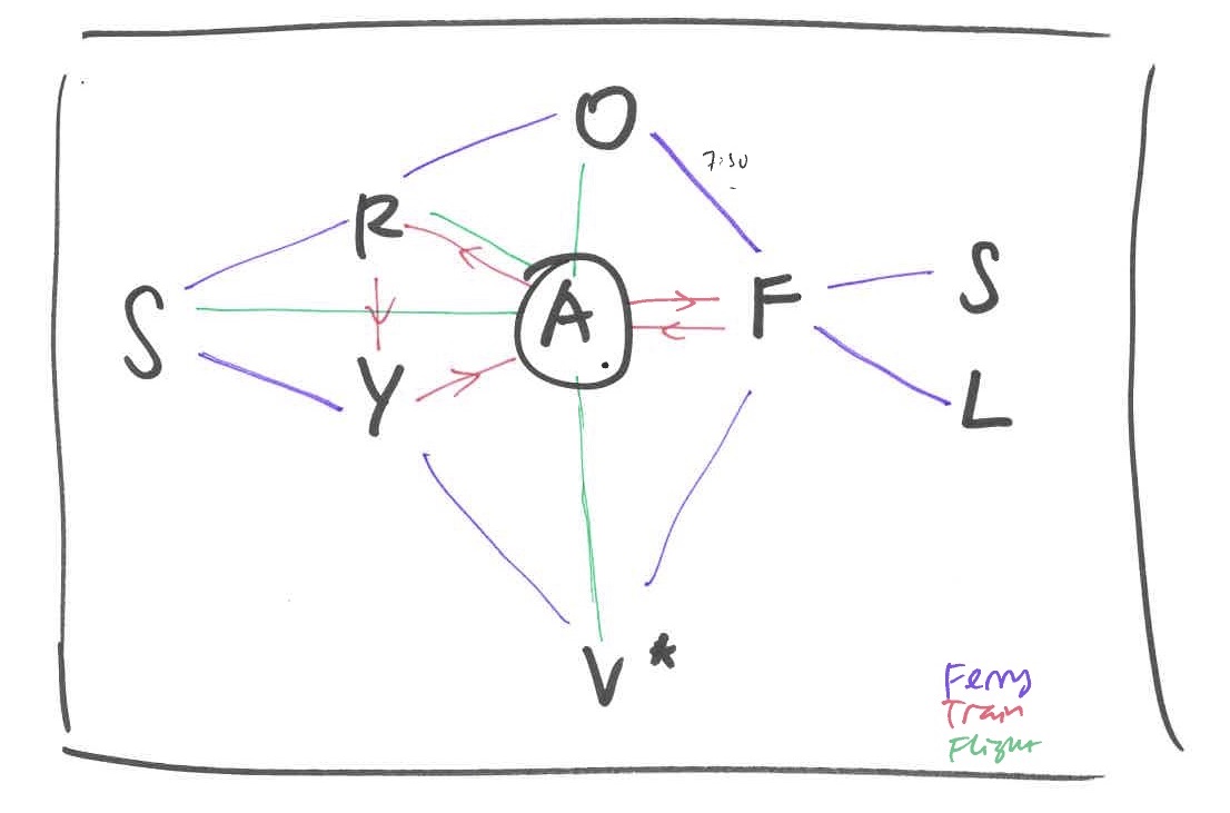
Iterations on Map
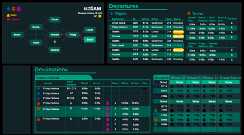
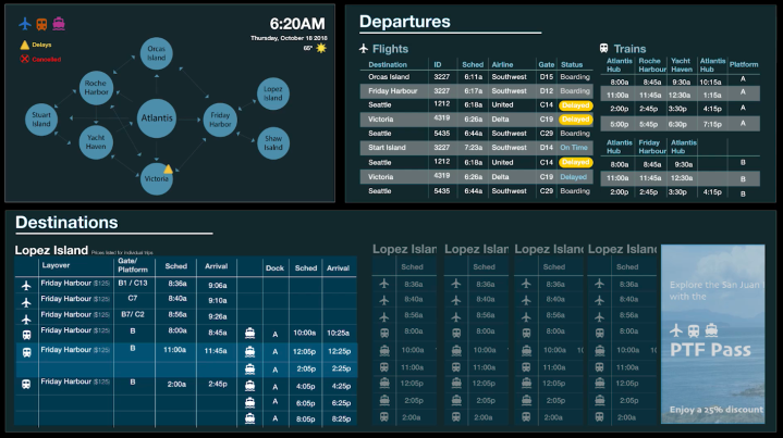
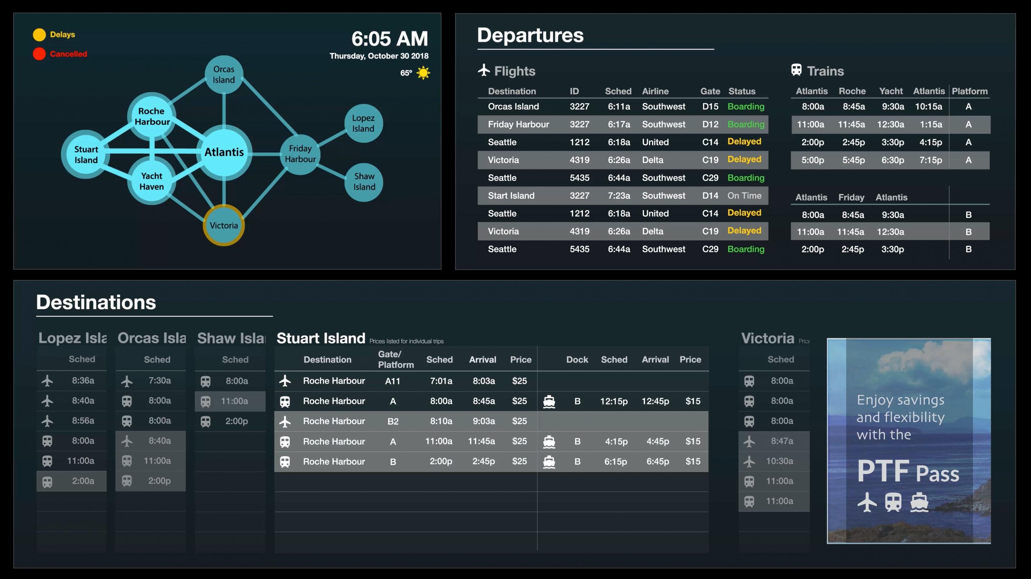
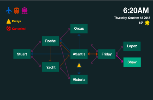
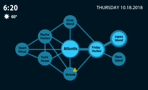
Initially, we designed the map section as rectangles linked by directional arrows, using different colors to show the different transportation modalities, as well as the directions in which they traveled. In our next iteration, we decided to change the shape of travel destinations to a circle, providing a smoother, cleaner feel. We also eliminated most of the colors, to make what we saw as the most important information provided by color (delays and cancellations) the most salient. We also highlighted the potential path to each individual island, which would coincide with that island’s card being displayed below.
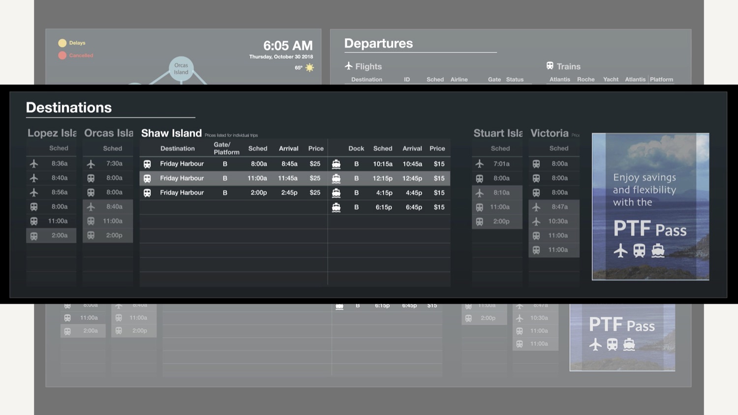
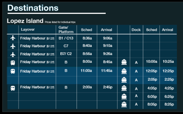
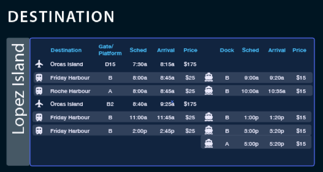
Iterations on Destination
For our later iterations, we changed the individual island destination displays to be less organized by a grid, and closer to the alternating color scheme as seen above in the immediate departure section. However, we decided to use color to organize the departures into rough time-frame blocks, allowing users to plan their itinerary based around the general time they would like to travel.
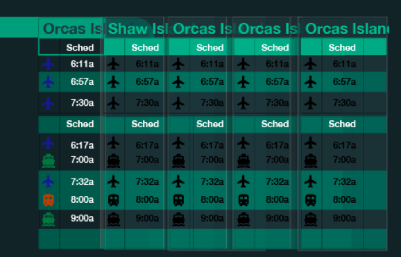
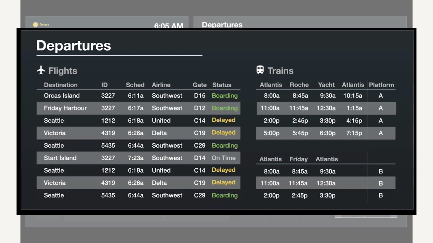
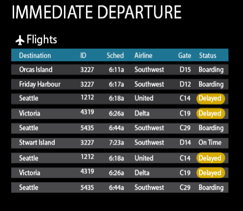
Iterations on Departure
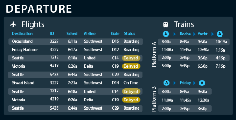
In our first immediate departure display, we had each departure listed on its own colored block, to provide separation. We felt that using an alternating color scheme in our final iteration would make is easier for users to scan down and find their particular flight or train, while adhering to the design rationale of most other travel displays.
Iterations on Color
In our first iteration, we wanted something clean and simple, with a light background and dark text. After viewing this color scheme on a larger display, we felt that this would cause legibility issues, so we moved to a darker background with lighter text and a green color scheme. Our final design use a blue color scheme, to provide more contrast with the yellow for the delay notification.