Skills
User research, storyboards, wireframes
Team member
Helen Tsui, Hamza Qureshi
Role
UIUX researcher and designer
Report It - Emergency Response Platform
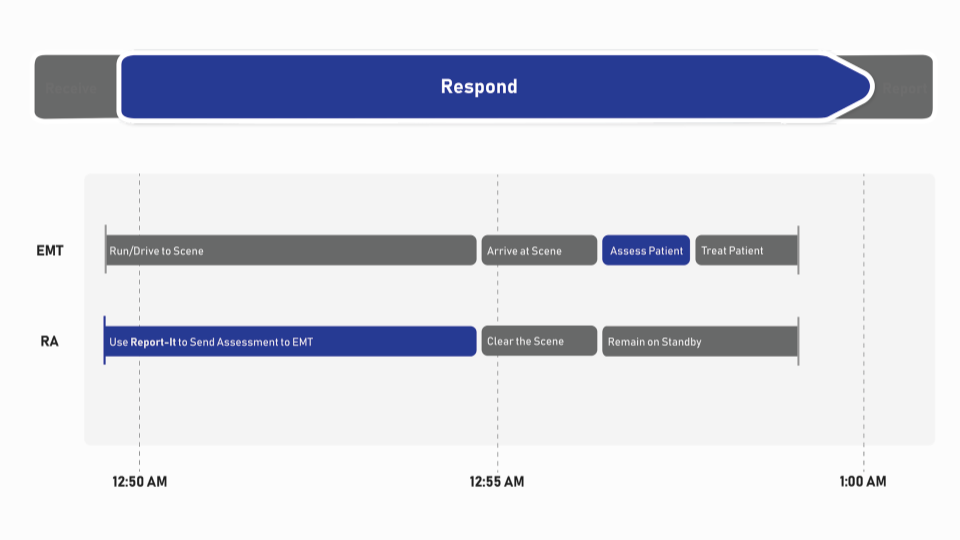
This goal of this project is to create a responsible website in the domain of emergency response. Report-It is an emergency response platform that makes use of the wait time between when a patient is identified and when emergency respondents arrive on scene to conduct prognosis. I conducted user research on multiple stakeholders to understanding their goals and needs, and found opportunities for our platform to improve the existing system. I also made wireframes, low-fi and high-fi prototypes for both mobile and desktop screens.
Process
Background + Guerrilla research
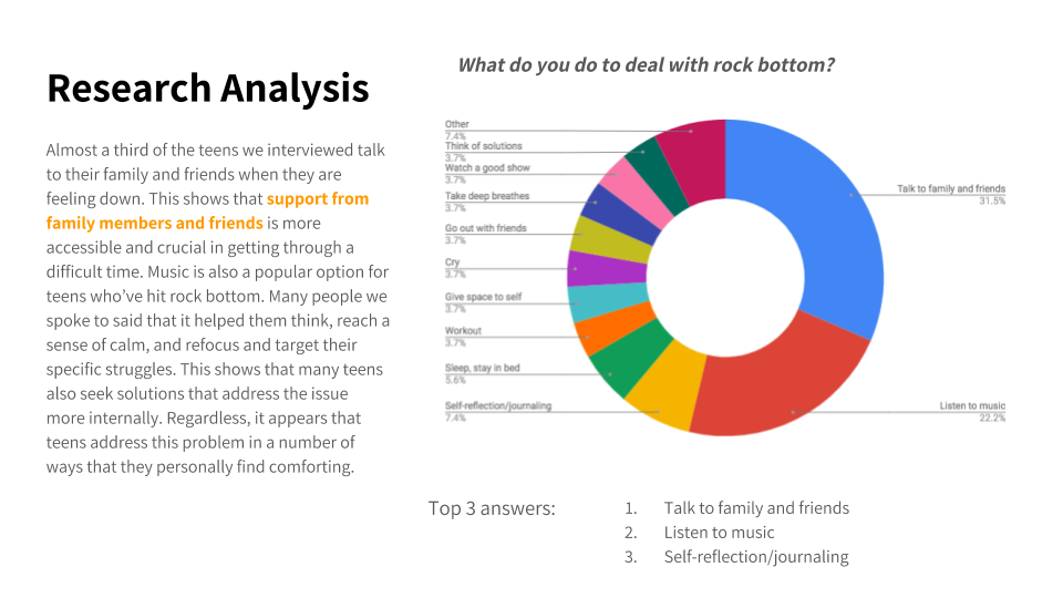
After several rounds of brainstorming within the team, we were all interested in exploring an emergency response situation that deals with anxiety attacks and and breakdowns. After identifying our potential users, service providers, and business owners, we prepared questions to ask during the guerrilla research. We went to UPitt’s first year dorm and asked students walking by to answer the following two questions. Even though the research process was successful, due to privacy and sensitivity concerns, the topic was put on a hiatus and pivoted to a new direction.

Understanding Customers
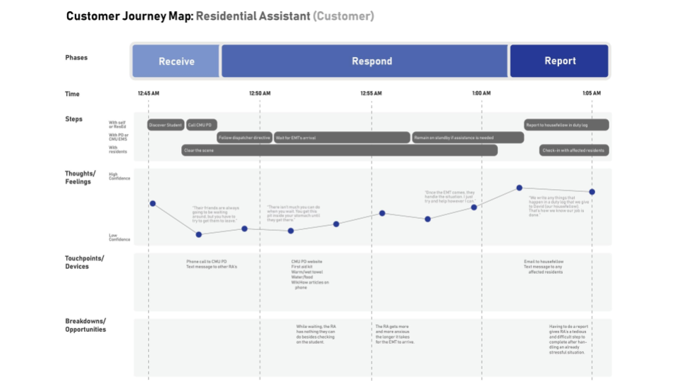
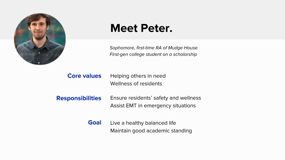
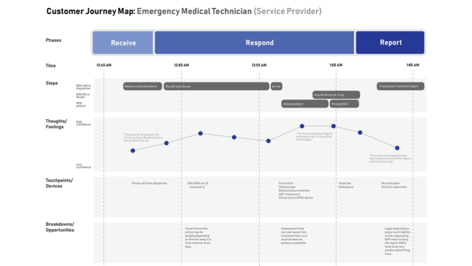
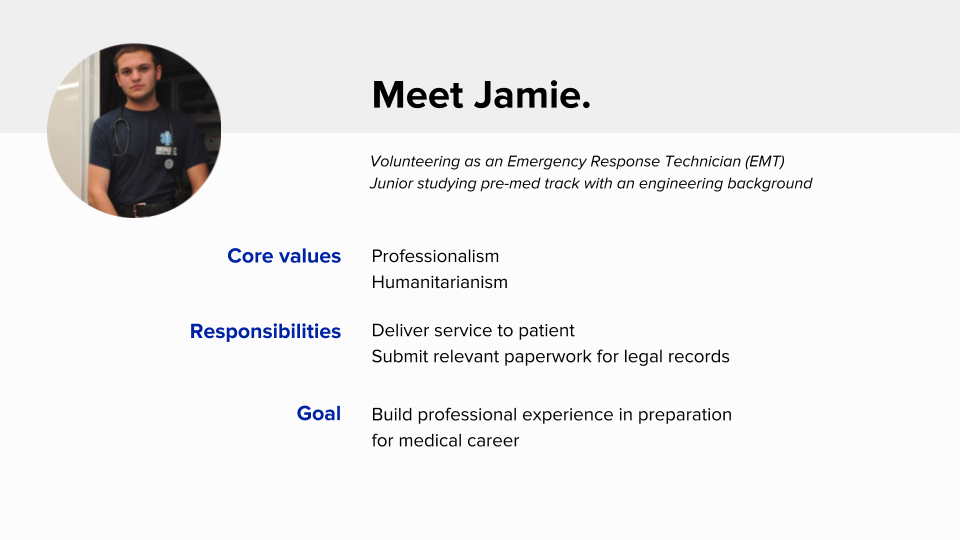
After some consideration, we decided to shift focus and redo our secondary research on freshmen dorms in CMU, we interviewed with 2 RAs in the Morewood freshmen dorm as well as 3 different Emergency Medical Technicians (EMT) to understand their goals, values and procedures when encountering potentially hazardous scenarios. According to the RAs, the most common emergencies that need EMT rescue are: 1) alcohol intoxication; 2) drug use / overdose; 3) accidental injuries. Alcohol consumption, in this case, is a topic of interest for us, and we also found that RA often encounter situations where they are unsure of if they should call CMU police for EMT assistance. They are also often torn between their social relationship with the residents, and confusion to how to best ensure residents’ safety and wellness. From this we created our Customer Journey Maps and personas.
Scenarios and Storyboards
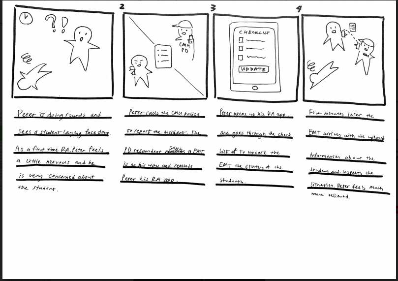
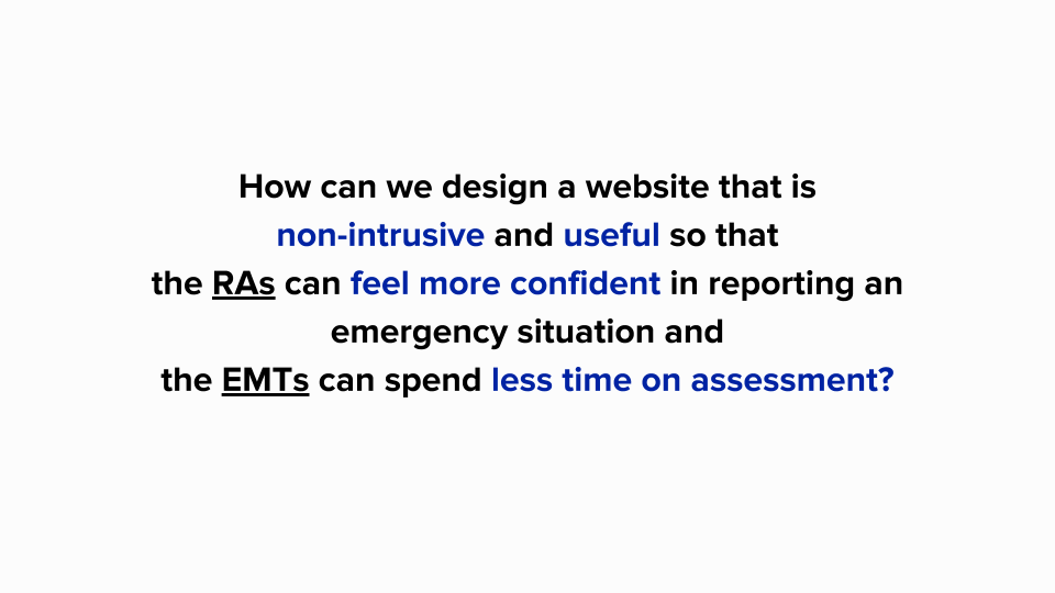
Based on our persona and interview results, we each brainstormed how RA Peter (our customer) would face a challenge and use a potential solution to reach a resolution. And then we created storyboards to help our stakeholders empathize with our customers. During our in-class speed-dating session, we received a lot of valuable feedback in regards to our storyboard ideas -- what the responsive website should be focusing on. Here is our final storyboard and "how can we" statement.
Digital prototypes
Low-fi prototype
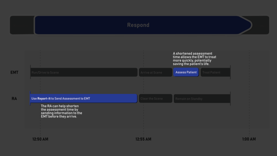
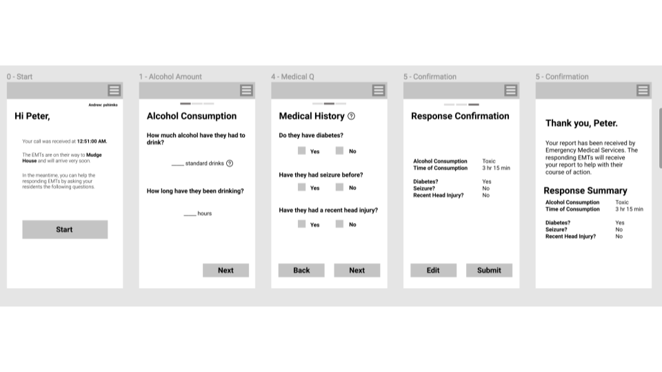
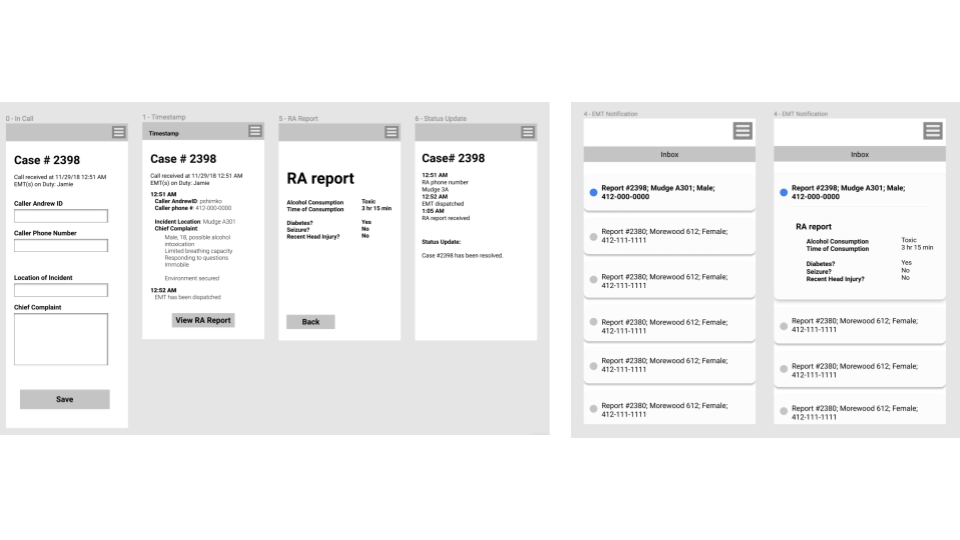
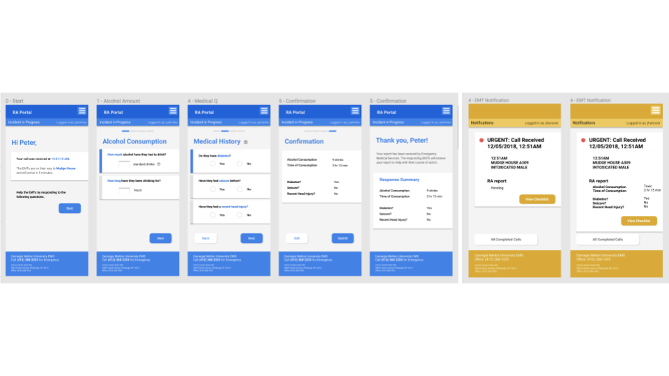
Based on feedback from speed dating and further interview with the EMTs, we narrowed down the RA survey questions to have two parts: alcohol consumptions and medical history. These are important information that the RAs can help the EMTs obtain that so that EMTs can spend less time on the assessment. For the EMTs version, we made a version for the supervisor and a version for the EMTs. However, as we realized later during the design phase, there is a lack of call to action for the EMTs to click on the report and does not create a sense of urgency.
Mid-fi prototype
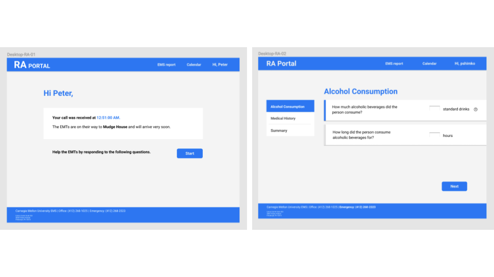
We chose blue for the RA version of the website that indicates calmness for users in emergency situation. And we used yellow for the EMT portal to differentiate the two user platforms. In addition, based on feedback on the low-fi prototype, we decided to focus on the EMT “inbox”, and present a call to action by changing the visual hierarchy of the texts.For the desktop version, even though we had more space, we chose to make the desktop version very minimal, given that in an emergency situation, RAs need to focus on the intoxicated resident and finish the survey without distraction.
High-fi prototype
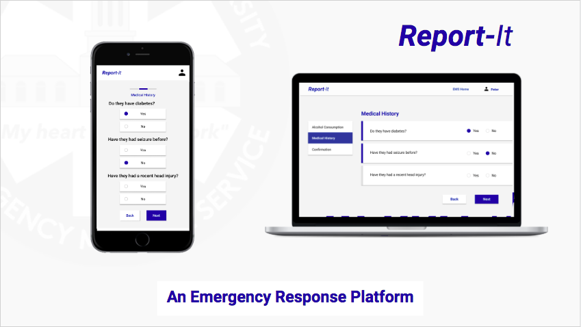
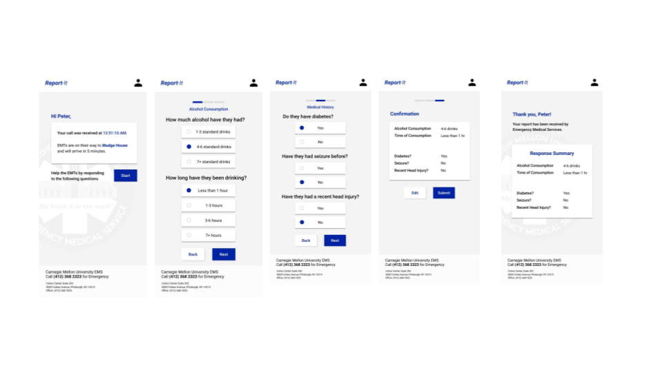
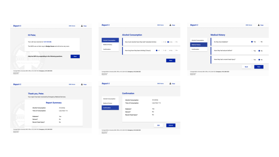
We gave our website a more punchy name: Report-It. We also changed the color scheme or our website to have a muted background with navy blue buttons and texts that call for users’ attention. We also uniformed users’ response to be multiple choice (instead of text input) to help speed up the time spend to complete survey, so that the RAs can still focus on the intoxicated student. Transitioning from mobile to desktop, we collated the multiple choices to be in one line, and show the survey progress on the side. (Please see full prototype interaction in the links below! )
Conclusion
Current State
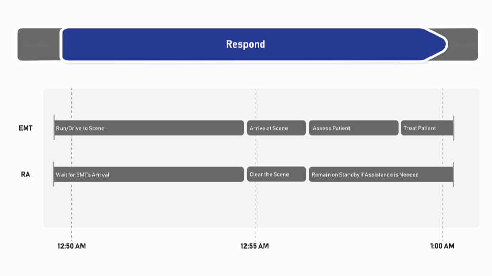
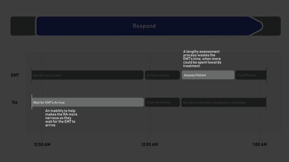
Currently, the RA waits for the EMT to arrive and feels really anxious but they don’t have anything to do. When the EMT arrives, they then ask the RA to gather important information to help assess the resident’s condition. The process of obtaining information usually stalls the assessment time and putting the resident’s safety at risk.
Projected State
With Report-It, the RA is able to utilize wait time to effectively help the EMT gather information, which allows him to feel more in control and confident. At the same time, the EMT will use the RA’s report, which helps them more quickly assess the resident’s condition and execute protocols accordingly.
